

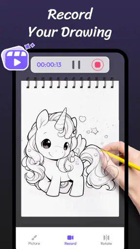
I approached AR Drawing Paint Sketch Trace as a practical drawing companion rather than a replacement for a full digital art studio. Its main idea is simple: use augmented reality to place a reference image in front of you, then trace what you see on paper or another physical surface. It also connects that process with sketch-style photo conversion, which makes it useful for people who want a starting point instead of a blank page.
That focus gives the app a very different feel from a conventional coloring app. You are not mainly filling enclosed areas on a screen. You are using your phone as a visual guide while your hand does the creative work. In my experience, that makes the app especially approachable for beginners, casual illustrators, parents looking for a guided activity, and anyone who enjoys anime-inspired drawing but feels unsure about proportions.
The app is free to install and is listed for everyone, with optional purchases ranging from $0.99 to $99.99 per item. The developer is ideaFun - Pixel Art Coloring Games Color by Number. It has built a sizable audience, with an average rating of 4.8 from around 70K ratings and over 5M installs. Those figures suggest that the basic concept is easy for many people to understand, although popularity alone does not solve the practical challenges of drawing through a phone camera.
How the current drawing experience works
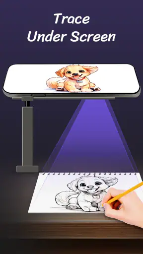
A phone-based projector for real-world sketching
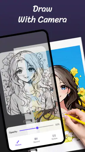
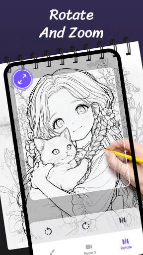
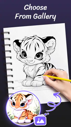
The central workflow is to choose or create a reference, position the phone so the image appears aligned with your drawing surface, and follow the visible lines with a pencil, pen, or marker. The camera view is important because the app is not simply displaying a static picture. It is trying to help you maintain a relationship between the reference and the physical page.
This is most comfortable when the phone can stay steady. A small stand, stack of books, or inexpensive holder can make a bigger difference than another drawing tool. Holding the phone in one hand while drawing with the other quickly becomes tiring, and even slight movement can make the projected guide drift. That is one of the first practical lessons I would give a friend: treat the phone position as part of the setup, not as a minor detail.
On a clean desk with good lighting, the concept is surprisingly inviting. I can see why someone who normally says “I cannot draw” would enjoy it. The guide reduces the intimidation of starting from nothing, while the final marks still come from the user. It feels more hands-on than tapping a color palette and more forgiving than attempting a freehand portrait immediately.
Anime references and the value of a manageable outline
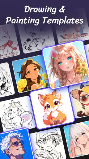
The anime-oriented use case is one of the app’s clearest strengths. Large eyes, hair shapes, expressive faces, and recognizable silhouettes benefit from a visual guide because beginners often struggle with spacing rather than with the act of making a line. Tracing helps reveal how much room a feature needs and where the major shapes sit relative to one another.
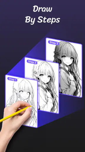
I recommend beginning with a simple outline instead of a highly detailed character. Fine hair strands and complicated clothing can turn a relaxed exercise into a frustrating hunt for tiny lines. A better workflow is to establish the head, body, main hair mass, and large accessories first. Once those proportions look right, add details by referring back to the guide. This produces a cleaner result and teaches more than trying to copy every line at once.
There is also a useful distinction between tracing and learning. If you only follow the visible contours, the finished drawing may look good without improving your understanding of construction. I get more value from the app when I pause after each major section and ask why the line bends there. That turns the projected image into a lesson in proportion instead of a disposable outline.
Turning a photo into a sketch reference
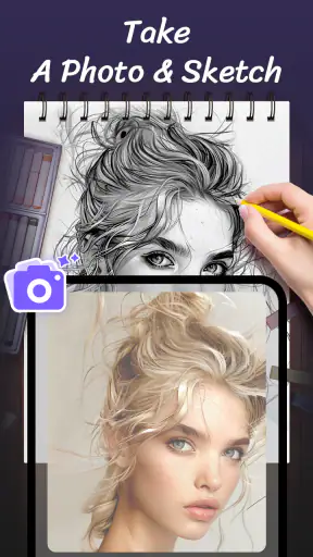
The photo-to-sketch direction expands the app beyond preselected character-style material. A familiar photo can become a reference for a portrait, pet drawing, object study, or small gift. This is particularly handy when a user wants to draw something personal but does not know how to simplify a photograph into clear lines.
Not every photo is equally suitable. A well-lit subject with a distinct silhouette is easier to interpret than a dark image crowded with overlapping objects. I would choose a picture with clear separation between the subject and background, then crop away distractions before trying to trace it. A busy photo can produce too many competing marks, and the result may become confusing on paper.
This workflow also works well for practicing observation. Instead of treating the converted image as an exact answer, I use it as a map of the important edges. I can ignore minor texture, redraw a feature more naturally, or combine the reference with my own changes. That flexibility is important because a traced photograph can otherwise look stiff or overly dependent on the original image.
Where the app fits among familiar alternatives
Compared with a standard sketching app, this tool has a physical advantage: the drawing happens on paper, so the finished piece can be displayed, colored with traditional materials, or given to someone. A regular digital canvas is better for layers, undo controls, brush variety, and precise editing. If your priority is polished digital illustration, the usual drawing software remains the stronger choice.
Compared with an ordinary coloring-by-number product, this app asks for more active participation. It does not reduce the entire task to choosing a numbered color. That makes it more satisfying for someone who wants to practice hand control, but less relaxing for a user who wants a completely automatic activity. The choice depends on whether you want to make marks yourself or simply fill a prepared design.
It also differs from a conventional projector. A physical projector can display a larger image and may be easier to use for a group or a large canvas, while this app is more portable and accessible. The trade-off is that the phone camera view and setup require attention. For a small sketchbook page, the phone approach is convenient; for a wall-sized drawing, another solution would probably be more appropriate.
What changed for people already using it
The current version is 1.4.18, and the app was released on August 20, 2024. I see that version information as useful context rather than a promise of a particular new feature. It indicates that the product is being presented as an actively maintained app rather than an abandoned experiment, but I would still judge it by how reliably the present drawing workflow behaves on my own device.
For existing users, a version update matters most when it makes the core routine less fragile: selecting a reference, keeping the camera view usable, adjusting the image, and completing a trace without unnecessary interruption. Those are the moments that determine whether the app becomes part of a weekly creative habit or gets opened once and forgotten.
If you already use it, my advice is to reassess your setup after updating rather than assuming the app alone will improve the result. Keep the same paper size, lighting, and phone position when comparing sessions. That makes it easier to tell whether a change in the app helped or whether a different angle, surface, or reference image caused the improvement.
Small techniques that make a noticeable difference
One of the most useful techniques is to begin with a light pencil and commit to darker lines only after the major shapes are aligned. The AR guide can make a line look correct from the phone’s viewpoint while it still feels awkward on the page. Light construction marks give you room to correct that without damaging the final drawing.
Another practical trick is to divide the reference mentally into large zones. For a face, I might establish the outer head shape and eye line before touching eyelashes, hair strands, or clothing folds. For an object, I start with its outer contour and the biggest internal division. This reduces the temptation to chase details that depend on proportions I have not checked yet.
I also find that a matte, uncluttered surface is easier to work with than a glossy or patterned one. Reflections and visual noise compete with the projected guide. A plain sheet of paper on a stable table gives the camera a simpler scene and makes the traced lines easier for my eyes to follow.
A less obvious use is collaborative drawing. One person can choose the reference and help keep an eye on the phone while another traces, which works well for a parent and child or two friends. It changes the activity from solitary screen time into a shared craft session. The limitation is that both people need patience, because even a small bump can require repositioning.
Where the experience still falls short
The biggest limitation is physical alignment. The app can guide your view, but it cannot hold the phone steady, keep your paper perfectly positioned, or prevent your arm from blocking part of the scene. These are not cosmetic inconveniences; they directly affect accuracy. Anyone expecting a one-tap conversion from photo to flawless drawing may be disappointed.
Screen brightness and room lighting also influence comfort. A dim display can make the guide hard to follow, while excessive brightness or reflections can make the camera view tiring. I would avoid judging the app from a quick attempt in a dark room. A bright, even environment is much more suitable for this kind of work.
The free entry point is welcome, but optional purchases are part of the experience, so users should be comfortable checking what is available before committing to a particular creative routine. I would not recommend buying anything immediately. First, test whether the basic tracing process suits your hand, your phone, and the kinds of images you want to draw. The app’s value depends more on that fit than on having the largest possible reference collection.
There is another limitation for experienced artists: tracing can become restrictive. If you already understand perspective, anatomy, and composition, you may prefer a blank canvas where you can build an image from your own decisions. This app is better as a reference aid, warm-up tool, or bridge into drawing than as the central workspace for advanced illustration.
Who should use it, and who should skip it
I would recommend it to beginners who want visible guidance, families searching for a simple creative activity, and traditional-art fans who like the idea of finishing a physical drawing. It is also a reasonable choice for someone who has photos they would like to reinterpret but does not know how to simplify them into a sketch.
It is less suitable for users who want professional digital painting controls, extensive layer management, or highly controlled editing. It is also not the best match for someone who dislikes setup, cannot keep a phone stable near the work surface, or wants an entirely passive coloring experience. In those cases, a dedicated digital art app or a conventional coloring app would be more efficient.
For a realistic everyday scenario, imagine having a free evening and wanting to make a birthday card. I would choose a clear photo of the recipient or a simple anime-style reference, place the phone on a stand, trace the large shapes lightly, and finish the card with colored pencils after removing the phone. That workflow uses the app where it is strongest: as a bridge from a reference on the screen to a personal object made by hand.
What I would watch in future use
When I continue using the app, I will pay attention to how smoothly it handles the full sequence rather than focusing only on the image selection. The important questions are whether positioning remains comfortable, whether references stay easy to work with, and whether the experience encourages users to develop their own drawing judgment instead of simply copying outlines.
I would also like to see the product continue balancing accessibility with creative control. Beginners need a clear guide, but returning users eventually want more say over how much of the reference remains visible and how they adapt it. That is the point at which a tracing aid can grow from a novelty into a dependable practice tool.
My final view is positive but measured. AR Drawing Paint Sketch Trace is a friendly entry into AR drawing, especially when the goal is to create something on paper without facing a blank page. Its strongest qualities are the physical, hands-on workflow and the approachable route from photo or character reference to sketch. Its weaknesses come from the same design: phone stability, lighting, and setup matter, and advanced artists may outgrow the guided approach.
Because it is free to start and carries an Everyone content rating, I think it is worth trying before making any commitment. Give it a stable surface, a simple reference, and enough light. If that small preparation turns the process into something you enjoy, the app can become a useful creative habit. If you want deep digital controls or instant polished results, I would choose a different category of tool instead. Its real appeal is not replacing artistic effort, but making the first confident line easier to draw.


